In the world of marketing, the use of color is a powerful tool for creating a strong visual identity and conveying brand messaging. As a brand strategist, understanding the psychology behind color can be the key to effectively connecting with your target audience and building emotional connections. From the impact of different color palettes to the use of color symbolism, mastering the art of color association is essential in creating a cohesive and impactful branding strategy. In this blog post, we will dive deep into the world of color in marketing, exploring the importance of color psychology, utilizing color theory in logo and branding design, and understanding the cultural influences on color perception. We will also discuss the balance between consistency and adaptability in color schemes, as well as the measurement of effectiveness in color strategies. Join us as we explore the colors of marketing and discover the powerful impact they can have on your brand.
Table of Contents
Importance of understanding color psychology
Understanding color psychology is crucial for businesses and individuals alike, as it plays a significant role in influencing human emotions, behaviors, and perceptions. Colors have the power to evoke specific feelings and associations, making it essential for brands to grasp the psychological impact of different hues and shades.
By delving into the world of color psychology, companies can strategically use colors to communicate their brand’s values, personality, and messaging. For example, warm tones like red and orange can convey energy, excitement, and passion, while cool hues such as blue and green often symbolize calmness, trust, and nature.
In addition, individuals can benefit from understanding color psychology in various aspects of their lives, from interior design and fashion choices to personal branding and self-expression. By knowing how different colors can impact mood and perception, people can make informed decisions when it comes to decorating their homes, choosing outfits, or creating their own visual identity.
Ultimately, grasping the psychological aspects of color can significantly enhance the effectiveness of branding, marketing, and overall visual communication. Whether it’s for creating a memorable logo, designing an engaging website, or crafting compelling advertising materials, being mindful of color psychology is key to making a lasting impression.

Exploring the impact of different color palettes
When it comes to design and branding, the choice of color palettes can have a significant impact on the overall visual appeal and message of a product or brand. Different colors evoke different emotions and associations, and the combination of these colors can further enhance or alter these perceptions.
Exploring the impact of different color palettes allows us to understand how certain combinations can convey specific messages or create specific atmospheres. For example, warm and vibrant colors can convey a sense of energy and excitement, while cool and muted colors can create a feeling of calm and sophistication.
The use of different color palettes can also help in targeting specific audiences. A colorful and bold palette might be appealing to a younger demographic, while a more subtle and earthy palette might resonate more with a mature audience.
In conclusion, the impact of different color palettes is undeniable in the world of design and branding. It is crucial for designers and brand strategists to explore and understand the psychological and emotional effects of different color combinations to create visual identities that effectively communicate the intended message and connect with the target audience.
Mastering the art of color association
Understanding the psychology of color is crucial in the process of mastering the art of color association. Colors can evoke different emotions and can even influence decision-making. By delving into the meaning of each color, designers can effectively use them to create a desired response from their audience.
Exploring the impact of different color palettes is another important aspect of mastering color association. Different combinations of colors can create varying moods and feelings. For example, warm colors like red and orange can create a sense of excitement and energy, while cooler colors like blue and green can evoke calm and tranquility.
Furthermore, utilizing color symbolism to convey brand messaging is an essential skill in mastering color association. Different colors can carry different meanings and connotations in various cultures, so it’s important to consider the context in which a brand operates. For instance, red can symbolize passion and energy in Western cultures, but it’s associated with luck and prosperity in Eastern cultures.
Finally, building emotional connections with color choices is a key element in mastering color association. The right combination of colors can create a sense of trust and reliability in a brand, while the wrong choice can be off-putting to potential customers. By understanding the psychology, impact, symbolism, and emotional connections of colors, designers can truly master the art of color association.
Creating a strong visual identity through colors
Utilizing color psychology to create a strong visual identity for your brand is essential in making a lasting impression on your audience. The colors you choose for your brand can influence how people perceive your business and can ultimately affect their purchasing decisions. Understanding the psychological impact of different colors is crucial in creating a consistent and impactful visual identity.
When building your brand’s visual identity, it’s important to consider the emotional connections that different colors can evoke. For example, warm colors like red and orange can create a sense of excitement and energy, while cooler colors like blue and green can convey a feeling of calm and trust. By carefully choosing the right colors for your brand, you can effectively communicate the values and personality of your business to your target audience.
Another aspect to consider when creating a strong visual identity through colors is the consistency and adaptability of your color scheme across different platforms and mediums. Your brand’s colors should be versatile enough to be used in a variety of contexts while still maintaining a cohesive and recognizable visual identity. This requires careful consideration of how your colors will appear in both print and digital formats, as well as how they will interact with other design elements such as typography and imagery.
By mastering the art of color association and utilizing color theory in logo and branding design, you can ensure that your brand’s visual identity is not only visually appealing but also effectively communicates the essence of your business. Ultimately, creating a strong visual identity through colors is a powerful way to differentiate your brand and leave a memorable impression on your target audience.
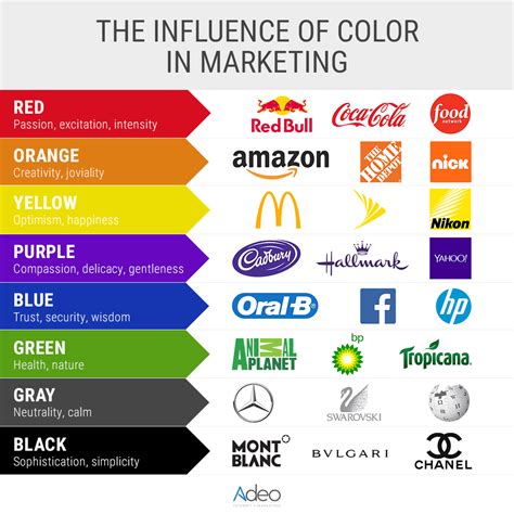
Using color symbolism to convey brand messaging
Color symbolism plays a significant role in conveying brand messaging and evoking specific emotions and associations in the minds of consumers. By strategically using color symbolism in branding, companies can communicate their values, personality, and identity more effectively.
For example, the color red is often associated with passion, energy, and excitement, making it a popular choice for brands that want to convey a sense of urgency or boldness. On the other hand, blue is commonly linked to trust, stability, and professionalism, making it a favorite among financial institutions and corporate brands.
By understanding the symbolism behind different colors, businesses can align their visual identity with their desired brand messaging. Whether it’s through a logo, packaging, or marketing materials, the strategic use of color can help reinforce brand values and connect with the target audience on a deeper level.
Furthermore, color symbolism can also vary across different cultures, so it’s crucial for global brands to consider the cultural implications of their color choices. While a specific color may carry positive connotations in one region, it could have negative associations in another, potentially affecting the brand’s message and perception.
Utilizing color theory in logo and branding design
Color theory is an essential aspect of logo and branding design, as it plays a crucial role in conveying a brand’s message, evoking emotions, and creating a strong visual identity. Understanding the psychology of colors and how they interact with human perception is key to creating effective branding strategies.
When utilizing color theory in logo and branding design, it’s important to consider the impact of different color palettes. Different colors have different meanings and connotations, so choosing the right combination is essential to effectively communicate the brand’s values and personality.
Furthermore, mastering the art of color association is crucial in logo and branding design. By creating strong associations between specific colors and the brand, companies can effectively build a visual identity that resonates with their target audience.
Lastly, by utilizing color theory in logo and branding design, businesses can create a strong and lasting impression on their customers. The right use of color symbolism can convey brand messaging and build emotional connections with their audience, ultimately leading to brand loyalty and recognition.
Building emotional connections with color choices
Color plays a significant role in evoking emotions and creating connections with the audience. It has the power to trigger certain feelings and associations, making it an essential element in branding and design.
When choosing colors for a brand or design project, it’s important to consider the emotional impact they may have on the target audience. Whether it’s the calming effect of blues and greens, the energetic vibes of reds and yellows, or the sophistication of blacks and whites, each color can evoke a different emotional response.
By carefully selecting the right color palette, designers and brand strategists can build emotional connections with their audience, influencing how they perceive and interact with the brand or product.
Furthermore, the use of consistent color schemes across different touchpoints can reinforce these emotional connections, creating a sense of familiarity and trust with the audience.
Understanding cultural influences on color perception
Color perception is not solely based on individual experiences or personal preferences. In fact, it is heavily influenced by the culture in which a person is raised. The way people perceive and interpret colors can vary greatly from one culture to another, and this has a significant impact on everything from design and marketing to communication and symbolism.
Cultural influences on color perception can be seen in a variety of ways, from the meanings assigned to specific colors to the way colors are used in traditional rituals and ceremonies. For example, while white is often associated with purity and weddings in Western cultures, it symbolizes mourning and funerals in many Asian cultures. Understanding these cultural variations is essential for anyone looking to create effective and impactful visual communication.
When it comes to branding and marketing, understanding cultural influences on color perception is crucial. A color that conveys a certain message in one culture may have a completely different connotation in another. For example, the color red is often associated with love and passion in Western cultures, but in some Eastern cultures, it is linked to luck and prosperity. This is why global brands must carefully consider the cultural implications of their color choices in order to maintain a consistent and positive brand image across different markets.
Ultimately, cultural influences on color perception highlight the importance of diversity and inclusivity in design and communication. By recognizing and respecting the varying cultural interpretations of color, designers and marketers can create more meaningful and relatable visual experiences for their audiences, fostering deeper connections and understanding across different cultures.
Balancing consistency and adaptability in color schemes
When it comes to creating a successful visual identity for a brand, color schemes play a vital role. Finding the right balance between consistency and adaptability in color choices can be a challenging task, but when executed correctly, it can have a significant impact on the overall branding strategy.
Consistency in color schemes is crucial for establishing brand recognition and creating a cohesive visual identity. Whether it’s through digital platforms, print media, or physical spaces, using consistent color palettes helps consumers to easily identify and connect with a brand. However, while consistency is important, there is also a need for adaptability in color schemes to ensure that the brand remains relevant and can evolve over time.
One way to achieve this balance is by utilizing a core color palette that remains consistent across all brand elements, while also incorporating secondary and accent colors that can be adapted to different contexts and marketing campaigns. This allows for flexibility in design while maintaining a cohesive and recognizable brand image.
Ultimately, finding the right balance between consistency and adaptability in color schemes requires a deep understanding of the brand’s values, target audience, and industry trends. By carefully considering these factors, brands can create a strong visual identity that is both consistent and adaptable, positioning themselves for long-term success.
Measuring the effectiveness of color strategies
Color plays a crucial role in the success of a brand’s visual identity and marketing efforts. It’s not just about choosing the right colors, but also about measuring the impact they have on the target audience. Understanding how color strategies affect consumer behavior and perception is key to creating a strong and impactful brand presence.
One way to measure the effectiveness of color strategies is through consumer engagement and response. By analyzing how consumers interact with different color schemes in branding materials, advertisements, and products, brands can gain valuable insights into which colors resonate best with their target market.
Another important method of measuring the effectiveness of color strategies is by tracking sales and conversion rates. Studies have shown that colors can influence purchasing decisions, so by monitoring the impact of different color choices on sales, brands can determine which color strategies are most effective in driving consumer action.
In addition, gathering feedback through surveys and focus groups can provide valuable information on how consumers perceive a brand’s color choices. This qualitative data can offer insights into the emotional and psychological effects of different color schemes, helping brands better understand the impact of their color strategies on consumers’ perceptions and attitudes.